Off Campus Library Services
Website Planning Document
Goal and Assumptions
Goals
Develop a page which responds with appropriate content depending on device screen width.
Add features which were not available on the prior page:
Searchbox(es) for databases, catalog, site;
Contacts bar/list with frequently requested tools, and,
Language translation option.
Assumptions About Usage and Content
Phones will be used primarily for communication and ready reference, therefore:
some content will not be displayed to narrow screens, and,
the OCLS email link will be provided, along with a warning the a myemail.indwes.edu address must be provided.
Large screen formats will be used for research and extended reading, and will display the full range of resources.
The responsive site will be designed to work with modern browsers (IE 10+, etc.). These browsers can interpret HTML5/CSS3, which will be employed for some features. (Learning Studio seems to have similar requirements, so eschewing hacks for old browsers and conforming to current web standards should meet the needs of most students.) The new site will degrade gracefully with older browser (IE9 and earlier, etc.).
Initial content will be ported from the existing OCLS site. Because the OCLS site is essential support for online students, the existing site will remain available in parallel for at least a month after initial responsive deployment. Reports of incompatibilities and errors will sought during that time.
Menu links will be spaced for accurate touch selection. Unaccessed links will be IWU red, visited links will be underlined without coloring.
To improve site responsiveness, client scripting will be minimized, image size will be limited to 50kb, and the total page weight should not exceed a megabyte.
Navigation will be through a menu that is vertical on narrow devices (phones), and horizontal in wider environments (tablets and desktops). Besides having each page title clearly visible, each page will have a unique icon.
To foster consistent staff and user training and support:
Maintain consistency in the behavior of the header, navigation and footer. A single page may have multiple horizontal content elements or columns on a desktop display, but a single column in a mobile display: therefore, list elements on a page will be organized vertically to provide a consistent layout. However, some pages may require the article area not to be in column format.
Rigden (2010) demonstrates that the color-blind can distinguish white, grey, black and blue. Red, gold, yellow and green are difficult for about 8% of the population to distinguish: therefore, these colors should not be used for navigation.
Dyson (2004) recommends that a line of text should consist of 50-70 characters (p.391), so as screen width increases the page displays multiple columns. Essential content to the right (it is first to display viewed vertically) and less important content or blank space in left columns.
A translation option will translate a page to the default language set by the user's browser; however,
document titles and proper names will be fixed in English despite the browser's language setting.
Sections
OCLS Logo
Image appears at the top and bottom of every page (reduced at top of page). Clicking the logo at the top of the page goes to the Home (index) page.
Contact Bar
To provide support staff with a clarifying question, horizontal contact information at the top of the page changes from red to blue when the the NAV becomes horizontal at 989px resolution (assuming tablet or computer at this size). Phone number always appears - other high-interest elements are added as the screen widens.
Masthead
A responsive H1 header that provides the page title, and at lower widths, OCLS branding.
Nav
Four main navigation links are presented. Until screen width reaches 989px, any menu presentation is vertical or limited to "Back" or "Page Map." Once the page width exceeds 988px, the four menu option titles each have links to subsidiary pages for touch users. However, the horizontal menu is mainly for mouse users, who may use dropdown menus to major sub-pages or page divisions.
A search box (currently for EBSCOhost using QuickLink code) may be expanded into some varient of the QuickLinks search. Ideally the searchbox could be toggled to search database(s), the library catalog, and the OCLS subdomain.
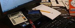
Page Image
Unique image appears on the top left of the page body.
Article
Main content area.
Content enclosed in the (div) Columnsetting (/div) will form in responsive columns at breakpoints, ie. 1245px and 1885px.
Aside
Optional content area currently not employed.
Footer
Responsively provides OCLS logo, contact info, and, should screen be large enough, OCLS mission statement and video welcome.
Mission statement and video link appear when at 989px and expand at huge 2525px resolution.
Screen Width Breakpoints
below468
Functionality on such a narrow view is limited to phone requirements. Telephone number appears at top of all pages. At this screen width navigation is limited to:
"OCLS Homepage" logo on top left
"Back" link on upper left
"Site Map" link on upper right, and
"List of Staffed Locations" link in the footer
widthreaches468px
OCLS anacronym transitions to full name in header. EBSCO search box appears in upper right.
widthreaches580px
"Contact Us" option appears next to phone number at top of page.
widthreaches750px
"Submit Request" option appears next to "Contact Us" at top of page.
widthreaches989px
The page title and "OCLS" branding in the masthead is replaced with article titling and branding.
Navigation becomes horizontal.
Contact information background changes from red to blue to distinguish mobile from desktop view for the support team.
Dropdown menu item maximum width starts at 200px.
"Back arrow" and "Site Map" directional links disappear with the onset of horizontal menu.
"APA 6e Guide" link appears next to "Submit Request."
widthreaches1079px
Article margins expand to 20px.
widthreaches1245px
"Library Lingo" link appears appears to the right of the link for the APA 6e Guide.
Footer expands to provide mission, and Address floats to right.
Dropdown menu item maximum width expands to 240px.
Columnsetting, if employed, becomes two column.
Page image on left expands to 256px width if earlier constrained.
widthreaches1565px
"Library Resource Guide" appears next to "Library Lingo."
widthreaches1885px
Columnsetting increments to three.
widthreaches2525px
Footer image expands to 120px, and mission layout becomes horizontal. Columnsetting may reach 4.
Print
Black text, with links indicated by underlining. Contact areas, the header, page icon and navigation menues are not displayed.
Colors
background-color: #980826;
IWU dark red is the background color of header, navigation, and footer areas. Text is white, normally italic; links are sans-serif white.
background-color:#005480;
IWU dark blue is the color of contact list or contact bar at top of page. Text is white, normally italic; links are sans-serif white.
color:#626466;
IWU grey is the color of muted header text. Font variant is small caps.
color:#c59603;
IWU gold is the color of the large header page title. Font variant is small caps.